So trose and I have been asked to put a bow on the Wikiotics work while we're between projects. We both hit some bumps at the end of the quarter, so there's a few unused hours left to put into this project. One of the things we've been tasked with is looking at the CSS and seeing if there is anything we can do to it to make it look a little better. Now, neither trose nor I are designers by any stretch of the imagination, but we've got a few ideas that might go a ways to making Wikiotics look more attractive.
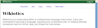
This is how Wikiotics looks today. The different actions possible on a page are hanging out awkwardly in the center, and there's no clear division between the header and the content. After looking at this for a while, trose and I decided that we would emulate a few of the more reasonable designs of the more common wiki systems out there.
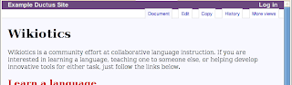
This is how Wikiotics looks on our local git. The 'tabs' have been moved to the right, and pushed further into the top bar (maybe too much). Further, the active tab bleeds into the content area, which is lightly colored to mark it as a separate area from the header and footer areas. The changed text and color on the top bar are not our doing, this appears to be a side-effect of running a subinstance of another page as we are, as is the case with the red link color. These changes are a small step, but I think they go some way towards making Wikiotics a bit more approachable to outsiders. There are a few more things to be done on Friday, but I don't think we're yet done looking at this.